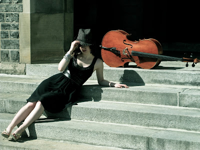
It's a rainy night here in Toronto, and I hope it's a sign that Spring is finally on the way because one of the best things about warmer weather, for me anyway, is being able to go on an outdoor photoshoot expedition :) It's so entertaining to come up with interesting new locations to set my designs against and just have fun with the camera. Also, it seems much easier for me to find a good spot outdoors rather than indoors, and the pictures almost always turn out better too.
My sister, Kathleen, whom you have met before in this blog, is one of my favourite models and, lets face it, is also the most readily available model who is willing to be coaxed into doing a photoshoot ;) She is a gorgeous girl and lovely cellist. Last Spring, for her graduating Master of Music Cello Recital, we went forth into the brisk Spring air to take some photos, which I later used to make her recital posters, invitations, and programs from. I was inspired by the Chanel and Dior Spring/Summer 2010 ad campaigns and used them as guides for art direction and styling ideas.
Here are the original ads. I love the absence of bright colours. Everything, even the black, is pale and muted, almost unnaturally so. In the Chanel ads, the stark contrast of black and white is strangely unified, blended by the diffused light. The Dior ads (from back in the John Galliano days, pre-ruined reputation & probable Ricardo Tisci at Dior / Haider Ackermann at Givenchy takeover, which I'm sure I will have something to say about in the near future, after the dust settles) really play up light and dark by using the blinds to create interesting shadows. I also love the use of hard architectural structures (doorways, stairs, walls) in both ads and how they simultaneously contrast with and complement the garments, suggesting a time, place, and story.
 |
| images via: Mama's a Rolling Stone, Nitro:licious, Hidden Garments, & YourStyletrend.com |
Now here is my interpretation, using the cello (and a few hats) as a prop.


I hope you like the photos! Hopefully there will be more to come very soon!!
Corinne
xoxo


Great photos! Very inspiring!
ReplyDeleteXoxO
Plami
http://fashion-thrill.blogspot.com/
~ * ♥ * ~
ReplyDeleteWhat a fun photo shoot Corinne ~ I really like the last few pictures; I think that they look really editorial. The hats are gorgeous too!
xox,
bonita of Depict This!
~ * ♥ * ~
So incredible. I love how you re-interpreted these ads. I love the shot of your shoes with the cello.
ReplyDeleteLove your post, your photos and most of all your vintage style!
ReplyDeleteGreetings from Greece! I am following you now. Please follow me too!
xoxo
http://filmwardrobe.blogspot.com/
They are brilliant. I have just dicovered you through IFB, and I do think your photos are add a new and personal twist to taken your own pics.
ReplyDeleteHave a superb weekend Corinne.
XXXXXXXXXXXXXXXXXXX
wow, great photos, you're really talented! :)
ReplyDelete- www.itsanewkate.blogspot.com
Gorgeous photos -- gorgeous girl too, of course!
ReplyDeletewhat a wonderful posts!! i love how your blacks muted too, just like you noticed in the campaign inspiration. great idea for a photo shoot :)
ReplyDeletewell done!- wish i had a sister to photo shoot!
Thank you all for your kind comments :)
ReplyDeleteCorinne xo
Love the photos. Great work.
ReplyDeleteRyan
http://www.fashables.com/w
These are incredible photos, and your sister really is the perfect model! Congrats on making it into links a la mode. This post certainly deserves it!
ReplyDeleteThis is so beautiful!!! I'm glad it made it to Links a la mode(where I found it).
ReplyDeleteartfullyartista.blogspot.com
what fun! gorgeous pictures!!!!
ReplyDeleteThanks so much!
ReplyDeleteCorinne xo
lovely photos, I love the archways you used!
ReplyDeleteHi Corinne. Was browsing through your blog and this one is great. Love your reinterpretation. That cello did work great. I love how you describe the ad campaigns too=)
ReplyDeleteAn impressive share, I just given this onto a colleague who was doing a little analysis on this. And he in fact bought me breakfast because I found it for him.. smile. So let me reword that: Thnx for the treat! But yeah Thnkx for spending the time to discuss this, I feel strongly about it and love reading more on this topic. If possible, as you become expertise, would you mind updating your blog with more details? It is highly helpful for me. Big thumb up for this blog post! Fashion
ReplyDelete